Omaze Rebrand + Design System
A major brand update required a full redesign of components, templates, and creation of a reusable design system.
Project Summary
The Omaze brand underwent a major visual update which included a new logo and brand colors. These updates were initially reflected in marketing and social but not in the user experience onsite. To create a consistent user experience across touchpoints, the brand guidelines needed to be translated into UI standards, and all components and templates across the site needed to be updated with the new styles.
In partnership with engineering, I also built a new reusable design system and patterns based on Material guidelines. The Figma system is a direct 1:1 with engineering’s Storybook, which streamlines work for both design and development, and create a shared source of truth for future features and iteration.
My Role
This was a multi-part project that touched all aspects of the company’s business. I led Product Design on this work, and collaborated with stakeholders across disciplines.
Primary areas of responsibility:
Creating new brand guidelines for use across Omaze products
Updating existing UI components and templates with new styles and working with engineering to launch a complete site rebrand in November 2021
Building a new reusable design system based on Material guidelines, requiring extensive collaboration with engineering, detailed annotations, and a 1:1 build in Storybook
Project Details
Company: Omaze
Dates: April 2020 - Ongoing
Project Type
Mobile Web & Desktop
Brand Strategy
Design System
Customer Interviews
Template and UI Updates
Customer Challenges
The previous Omaze brand did not reflect the company’s ethos and was not giving users a consistent experience across touchpoints.
Internal Stakeholder Challenges
Design and Engineering do not have a shared source of truth for UI components, resulting in duplicative work to rebuild similar elements in new features instead of using existing design patterns.
opportunity
Create a unified user experience for customers by building a consistent and recognizable set of UI patterns and styles.
These can be applied across components, and reused by both engineering and design to work more efficiently.
Key Work
New UI styles
Create cohesive style system that overlays onto components
Implement new brand colors for better accessibility and more consistent digital experiences
Update typography system and grids
Create guidelines for marketing and social to maintain cohesive user experience
Complete site rebrand in November 2021
Updated all the existing components with new styles
Set recognizable UI patterns
Built entirely new templates
Worked with engineering to update site templates
Homepage updates – on the left is the old brand, the right is the updated UI.
Create reusable design system
New system based on Material guidelines
Modular reusable components
Extensive annotations indicating structure and usage of components
1:1 build with Storybook, all components are pixel perfect in Figma and can translate clearly to code
Reusable tag component
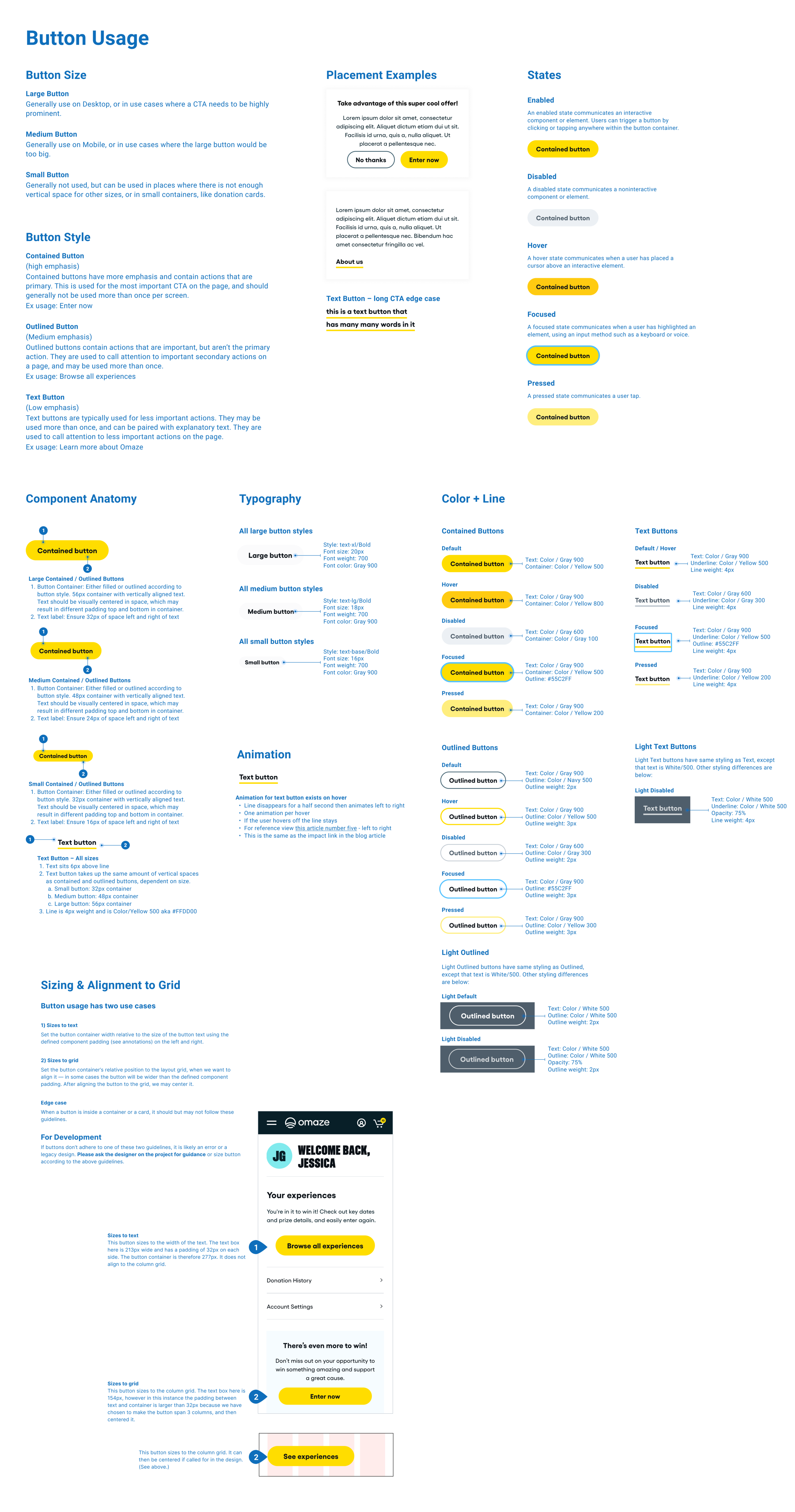
Reusable button components
Detailed annotations


